Resource depletion is easy to grasp. As every beer drinker knows, a glass starts full and ends empty. Oil and gas are fossil fuels formed in the geological past. This means that they started running out on the day we started using them. But I think this business of running out has confused many people. It is not really the issue. What matters much more than when the last drop of oil will be used is when production will reach its peak and begin to decline. So the primary interest of my work is to try to determine when the peak will happen.
Why do we need to know?
Well, because the world runs on oil, that's obvious: 40% of all traded energy is oil; 90% of transport fuel is oil. And as gas depletes, too, a diminishing supply will have a big impact on electricity generation. Furthermore, oil and gas are critical inputs in agriculture and for the production of petro-chemicals. So I think there is no more crucial factor to take into account in today's world. I suggest that the onset of decline speaks of recession, if not depression. It speaks of starvation because the population of the world has risen six-fold exactly in parallel with the increase in oil production, so logic tells you the decline of oil will have a serious impact on population. It speaks of conflict, or at least great political and geo-political changes.
So if the dates on which oil and gas production peak are so crucial, why aren't we told when they are?
That is, I think, perhaps an even more interesting subject than the fact of depletion itself. Why is depletion not at the top of every agenda? After all, measuring the size of an oil field is not that difficult. It is well within the capabilities of experienced engineers and geologists. And the world has been thoroughly explored. Surely then, we can have a good idea about how far along the depletion curve we are.
Is the glass half empty? If the turning point is that important, and so easily determined, why aren't we told when it is?
I think the short answer is that those who know don't wish to tell us, and those in government prefer not to know, because politically it is always easier to react to a crisis than to anticipate one. If I'm right, we have two vested interests: one group of people who don't want to reveal what the situation is, and the other group of people who don't want to hear it in any case. The importance of books like this is to try to raise the issue in the public domain.
Confusion is the means by which the truth about depletion is concealed and obscured. Even the definitions are confusing. There is no standard definition of what we are talking about. The distinction between conventional and non-conventional oil, or unconventional as it is sometimes called, is often made but the terms are used in very different ways by different authors. The problem arises because there are many different types of oil, each with its own characteristics and depletion profile.
Which types are conventional and which not? It is obvious that producing oil from a Middle East well, or a North Sea well, is a very different business from digging up a tar sand in Canada with a shovel. These are the two extremes of a wide range of different oil categories; each needs to be analysed, measured, and have its depletion profile developed. The more we go into detail, the greater the confusion. How are gas liquids - the liquids that condense from gas - to be treated? Then there is the issue of refinery gains: the refining process adds volume so that more comes out than goes in.
And what about war loss? When they burnt up all that oil in Kuwait, was this production? In the sense that it reduced reserves it was production, but it certainly wasn't supply. The statistics for gas variously refer to "dry" gas, from which the dissolved liquids have been removed; or "wet" gas; or "marketed" gas. Flaring gas, reinjecting to support pressure, and operating usage are further causes of confusion. There is such a maze of conflicting, uncertain, weak definitions that everybody is talking at cross purposes.
On top of this we have confused reporting. As I said, estimating reserves is a scientific business. There is a range of uncertainty, certainly, but it is not an impossible challenge to get a good idea of what a field contains. Reporting the result, however, is a political act, whether a company is reporting to a government, or an employee is reporting to his or her superiors. I worked in the oil industry for many years and I don't think I ever told the truth about the size of a prospect. This was not the game we were in. As we were competing for funds with other subsidiaries around the world, we had to exaggerate. So the reporting issue is extremely confused and is another main reason why depletion is not well understood. Furthermore Stock Exchange rules were introduced to encourage understatement, because to overstate was close to fraud. So the Stock Exchange rules were designed primarily to understate the size of the reserves. There was no problem about saying they were less, but there were great risks if you exaggerated. For most purposes this doesn't matter in the least: it was just the way the industry runs. But if we want to model depletion, we need valid reserve estimates, and above all, valid dates.
So I come to the issue of confused dates. An oil field is found when the first borehole is drilled into it. An oilfield contains what it contains, for the simple reason that it was filled in the geological past. Consequently, all the oil ever to be recovered from it, whatever the technology used and whatever the economic conditions, is logically attributable to the first discovery. After all, if we had not been born, we would not have a career of any kind. So I think that the date of a field's discovery is quite as important as the amount of oil or gas it contains.
REALITY AND ILLUSION
Figure 1A1 shows the importance of the date
issue. The lower curve shows public domain data
on reserves. 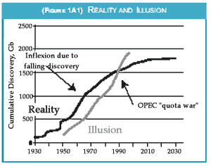 They've been growing consistently
since 1950. There was a great surge in the late
'80s. It is eminently reasonable for somebody
looking at this data set to extrapolate it onwards,
and many economists do just that giving governments
the false impression that the reserves keep
on growing for ever. That's what this plot would
suggest. But then if we backdate the reserve revisions
to the date on which the fields concerned
were discovered we get an entirely different picture.
We find that peak rate of discovery came in
the mid '60s and that it has been falling ever
since. If we extrapolate this firm trend of falling
discovery on out, we get a firm picture what of
left to find and produce. The contrast between
the upper line produced by backdating and
using real numbers and the lower line, which is
what is in the public domain, has confused
many analysts.
Then there is the data itself, another source of
confusion. Companies don't really like to talk
too much to each other directly about their
reserves but they do like to know what each
other is doing. Accordingly, they collaborate
with commercial firms to put the information
together in an industry data base. The problem
is that it costs you over $1 million to get into it.
This puts it out of range for most analysts who
turn instead to two trade journals, the Oil and
Gas Journal and the World Oil who have done
a heroic job over many many years compiling
the information from governments and from
industry where they can, but as trade journals
they are not competent to judge the validity of
the information they compile. There's also the
BP Statistical Review of World Energy, the bible
for most analysts, many of whom mistakenly
think that the statistics in it have the tacit blessing
of a major international oil company. They
don't. They are simply reproduced from the Oil
and Gas Journal. And lastly, we at the
Association for the Study of Peak Oil, ASPO,
are trying in a humble way not to mislead by
putting out the best data that we can assemble.
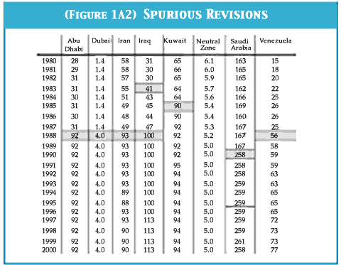 |
| The sudden jump in oil reserves in 1988. The figures are in billions of barrels. |
Table 1A2 illustrates this flawed database. It shows that in 1985, Kuwait added 50% to its reported reserves, although nothing particular changed in the reservoir. It did so because OPEC quota was based in part on reserves: the higher the reserves, the higher the quota. That action, incidentally, greatly upset its neighbour Iraq and was one of the causes of the Gulf War. Then moving to Venezuela, in 1988 it doubled the size of its reserves, doing so by including the huge amounts of heavy oil that had been known for years, but which it now decided to include in the resource base for no particular reason. Its action then caused Abu Dhabi, Dubai, Iran and Iraq to retaliate with enormous, overnight increases in reported reserves to protect their OPEC quota. It is interesting to note that the Neutral Zone, which is owned equally by Kuwait and Saudi Arabia, had two owners with no motive to change the numbers.
The table also shows another anomalous feature. Is it at all plausible that Abu Dhabi has had exactly 92 billion barrels of reserves for twelve years despite their depletion as a result of production? For reserves to stay the same despite production means production has to have been exactly matched by new discoveries or by reserve revision. I accept that the early numbers were too low, having been inherited from the private companies that ran the fields before they were being expropriated. Some increase was called for, justified and reasonable. The point is that nothing happened in 1988, and the revisions, whatever the true number might be, have to be back dated to the discovery of the fields concerned, many of which had been found up to fifty years before. This emphasises the critical importance of back dating the numbers properly.
As you have to find oil before you can produce it, the past discovery trend shows us by extrapolation how much there is yet to find in the future, and, if we deduct how much has been produced so far, how much is left to produce in the future.
Figure 1A3 shows Shell's record of discovery
since 1885.
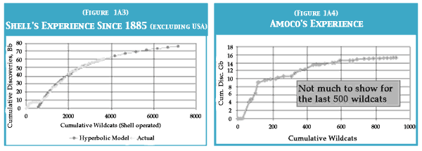
It's absolutely remarkable that the
actual discovery matches so closely the theoretical
curve. Shell can be extremely proud of this
record, because it shows that they were using
the very best of technology and were very efficient,
searching the world for the biggest and
best prospects. Their performance was outstanding,
but the graph also tells us that they
have found about 80% of all they can ever hope
to find no matter how hard they try. Other companies
were very much less successful. Figure
1A4 shows that poor old Amoco really found
nothing with the last 500 wildcats it drilled, a
performance vastly inferior to Shell's and of
course it has now disappeared, merging with
BP, for very obvious and good reasons.
USA
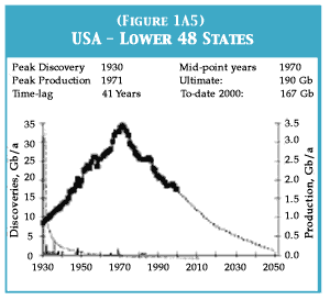
Let us now look at the United States in Figure 1A5. Discovery peaked in 1930, roughly, with
the East Texas field (just off to the left of the
curve). It has been falling ever since. Despite
having all the technology, all the money, all the
incentive, they just weren't able to counter this
downward trend. And here we see the peak of
production that followed the peak of discovery
after a time lag of forty-one years. And there is
really nothing at this late stage that can reverse
the downward trend of the 48 contiguous US
states. Certainly we can add something for the
deepwater, but that is a different category. And
it explains, incidentally, why the United States
government officially states that access to foreign
oil is of vital national interest, justifying
military intervention.
NORTH SEA
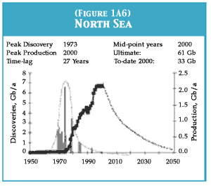
Now let us look at the North Sea in Fig 1A6. It
shows a very similar pattern. Discovery very
clearly peaked in 1973 and it's a long time since
a giant field was found there. The corresponding
production peak was predictably passed in
the United Kingdom in 1999, and output is
falling fast. Norway is not far behind, as now
admitted by the Norwegian authorities. So there
is a simple and very obvious relationship
between the peak in discovery and the peak in
output.
WORLD - CONVENTIONAL OIL
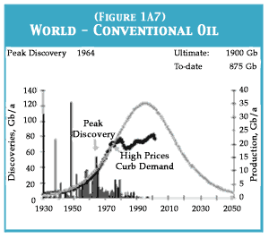 Figure 1A7 shows the world picture. The vertical
bar shows discoveries, with the spikes being
the very large Middle East fields. Peak discovery
was in 1964. The grey line shows the theoretical
bell-shaped curve that would have been
achieved had it been an entirely open environment
of production and consumption. Therewas a close match until the oil shocks in the
'70s, when high prices restricted demand. This
means that the actual production peak will be
lower and later than would otherwise have been
the case, but the good part about that is that the
rate at which output eventually falls will be less
rapid. The graph covers conventional oil only.
CONVENTIONAL OIL SCENARIOS
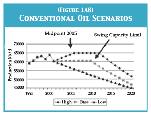 No one can predict the near-term future with
any confidence on the brink of war but one has
to do one's best. The middle line in Figure 1A8
supposes that conventional oil production will
stay more or less at its present level until 2010
because recession will reduce demand. After
that, however, my guess is that the five main
Middle East producing countries will no longer
be able to increase their output by enough to
offset declines in the output elsewhere and a
long-term decline in output will begin. Of
course there are other scenarios. You can picture
a decline from now on, represented by the
lower line, or you can have an economic recovery
for a few years, giving the higher curve
shown by the upper line, but a more rapid
decline in output when that eventually begins.
In all of these scenarios, however, the midpoint
of depletion, which more or less corresponds
with peak production, comes around 2005.
PRODUCTION FORECAST
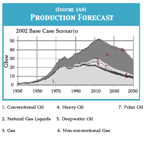 Figure 1A9 sums up the story as well as I can
put it together. The grey area is conventional oil
as I define it, with a plateau up to 2010 and the
onset of long-term decline then. The darker
area above it is the heavy oils from Canada and
Venezuela that I think will continue to increase
in production. Then we have deep-water oil, a
rather special and very difficult environment,
where I picture a peak coming also around
2010. This might be a bit optimistic, but that is
how it sits at the minute. And then there is polar
oil. The Russians tell me that they have hopes
for large new discoveries in their Arctic regions.
I am not sure how valid that is, or whether it
will happen, but I give them some credit for
that. Then we have gas liquids, they are an
increasingly important fuel for the future, and of
course they derive from gas. Gas itself is number
3. I expect output to reach some sort of
plateau around 2015 if new pipelines to Central
Asia and the Middle East are constructed. And
then at the top we have a few non-conventional
gases, such as coalbed methane.
I have published this graph in various places and was immensely gratified and impressed to find on my recent visit to Norway, that this very plot was reproduced in a BP article in an official Norwegian publication. I wouldn't give much for the author's future in the company, because the company does not encourage such revelations. But truth does somehow filter out in the strangest ways.
PUBLISHED ESTIMATES
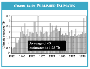 There are other estimates. How does what I
have shown you compare? Well, Figure 1A10
shows 65 estimates of the world's oil reserves
published over almost as many years. Of
course we don't exactly know what definitions
the various authors were using but by and
large it gives a rounded number of 2 trillion.
Many of these estimates were by major companies,
Shell, BP, Mobil and so on. So, when I
say that the amount of conventional oil ultimately
recoverable is 1900 trillion barrels, I'm
not far off the average of 65 published estimates
by the industry itself and by everybody
else qualified to pronounce on it. My figure
cannot therefore be regarded as an extraordinarily
unreasonable one.
DISCOVERY
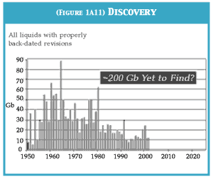 Figure 1A11 plots discoveries with proper
back dating to the time each was found. It
shows that the rate of discovery has been
falling since 1964 and it is pretty easy to see
that if the downward trend continues, only
around 200Gb more will be found.
ABSURD SCENARIOS
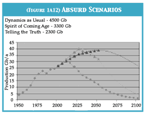 Shell is famous for its energy supply scenarios
up to 2050, which the company publishes
under heroic names. The grey line in Figure
1A12 shows Spirit of the Coming Age which
seems at first sight to be eminently sensible as
it shows a peak around 2025. By contrast, the
black line represents Dynamic as Usual which
has oil output rising to the end of the study period.
But if we extrapolate both curves, we find
that the Dynamic as Usual scenario implies as
much as 4,500 billion barrels of resource, more
than double the 65 published estimates that I
referred to a moment ago. The Spirit of the
Coming Age is a bit better, it is about 3,300 billion
barrels and it does peak and decline in a
reasonable way. I would propose, however, that
we introduce a third scenario, which we could
call Telling the Truth based on the 65 published
estimates. That is represented by the lower line.
GAS - THE UNEXPECTED CLIFF
I should say something about gas. It behaves
very differently from oil due to its higher
molecular mobility. More was generated in
nature than was oil, but that is offset by the fact
that more has escaped over geological time, as
no geological seal has perfect integrity. More is
also recoverable from the reservoir, with 70-
80% being normal, compared with an average
for oil of about 40%. This mobility means that
an uncontrolled gas well would deplete an
accumulation very quickly. In practice therefore,
production is normally set at far below the
natural capacity to provide a long plateau rather
than a short peak. 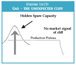 In an open market, such as in
the United States, gas is traded on a daily basis
through a pipeline network, as the various suppliers
vie with each other in drawing down their
inbuilt spare capacity, eventually supporting
production with the help of compressors.
Generally, prices have fallen as the original
investments were written off, attracting new
customers. The end of the production plateau
however comes abruptly and without market
signals, as now appears to be happening.
Whereas the oil market is global due to ready transport by tankers, the gas market is regional with three main hubs in North America, Siberia and the Middle East-Central Asian Region. There are also local markets, and substantial amounts of stranded gas in remote locations.
These circumstances make it difficult to model gas depletion. The global endowment seems to be about 10,000 trillion cubic feet (Tcf), of which about one quarter has been produced. The United States increasingly relies on Canadian imports and Arctic sources when costly new pipelines have been built. Europe is a similar position, with its indigenous supply set to decline steeply, but it has the advantage of being able to access supplies in Siberia, North Africa and eventually the Middle East and Caspian, although competing there with the demands of Southeast Asia. It would be reasonable to contemplate a global plateau at about 130 Tcf/annum from 2015 to 2040, followed by a steep decline.
Various non-conventional gases, mainly coalbed methane, will become more important in the future, already meeting about 10% of US needs. Methane hydrates occur as solids in the form of disseminated granules and laminae, meaning that the methane cannot migrate to accumulate in commercial quantities. They are well described as the fuel of the future and likely to remain so.
A few words now about Ireland. I think Ireland is very vulnerable. It has no coal or oil to speak of. It has one nearly-depleted gas field, Kinsale, to which they are now adding a small satellite and one new gas field, Corrib, which is potentially very important as it offers temporary relief from increasingly unreliable supplies of gas from the United Kingdom and Europe. Without Corrib, Ireland is very much at the end of the line but with it, if gas consumption could somehow be capped at the current level, the country could get by to around 2020 with modest imports from the United Kingdom. But as the United Kingdom will become a net gas importer by around 2007 if not before, Ireland will be relying on gas from Siberia. I don't think I would have too much confidence in being able to switch on the light at will in such a dependent situation.
IRELAND'S ELECTRICITY FUELS
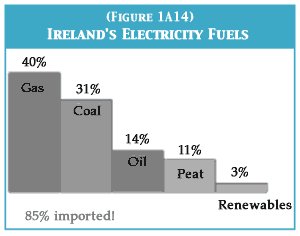 Figure 1A14 shows the fuel sources for
Ireland's electricity: 85% of it is imported. Gas
and oil make up over half of it.
Fortunately, Ireland can weather the storm if it adopts the right policies. Its main advantage is that it has a small population and a fertile land. So what should it do? First it should study the depletion issue, ignoring all advice coming from the oil industry, from the European Union, and particularly that from the International Energy Agency from which it would be an extraordinarily good idea to resign.
People should be prepared by the government for a recession caused by the high cost of imported energy. The ESB should not be privatised as there is no point in fragmenting the electricity supply industry into lots of companies dedicated to reducing the cost of energy when the purpose should be to increase the cost so that we become less dependent upon it. Instead, taxes on oil and gas should be raised drastically although people should be given a small tax-free ration which if they don't use they can sell. Energy saving should be encouraged using a combination of taxes and incentives.
The government should enter into a longterm contract with Statoil for the country's oil supply or Irish entrepreneurs could find privileged access somewhere to enough oil to meet the country's modest needs. Fuel for ships and aircraft should no longer be tax-free. The government should also encourage the search for oil and gas on the Atlantic margin but not rely on finding anything there. About 1.5 billion dollars have already been spent looking for oil off Ireland and 170 wildcats drilled with very little to show for it. Of course, nobody actually spent their own money on this prospecting as it was largely covered by tax write-offs in the US but even so, it was a lot of money to spend looking for very little.
So don't spend public money looking for oil off
Ireland. That money would be better spent
encouraging the development of renewables.
My final message is simply that the time to act
is now as there is not more than about ten years
until the global peak. We have no more than
about 20 years to establish a long-term sustainable
energy supply system, and we'd better use
that time well to prepare before the inevitable
decline begins.
This is one of almost 50
chapters and articles in the 336-page large format book, Before the Wells
Run Dry. Copies of the book are available for £9.95 from Green Books. Continue to Panel 1 of Part One: Will oil from tar sands enable the global supply to be maintained?
